Role: Graphic Designer / Brand Identity Specialist
Challenge: To create a distinctive visual identity for this premium Irish loose-leaf tea brand that communicates high quality while appealing to a mass market sensitive to pricing. This project required the development of a scalable visual system across the logo, packaging, and digital presence.
Logo Conceptualization & Brand Story:
The design process began with extensive brainstorming sessions with the client to define the brand's core identity and origin story. Based on these insights, the final logo direction focused on symbolism featuring tea leaves and feathers. These elements were chosen to visually convey the brand's core messaging, balancing natural origins with a sense of delicacy or specific narrative attributes.


Developing a Scalable Packaging System:
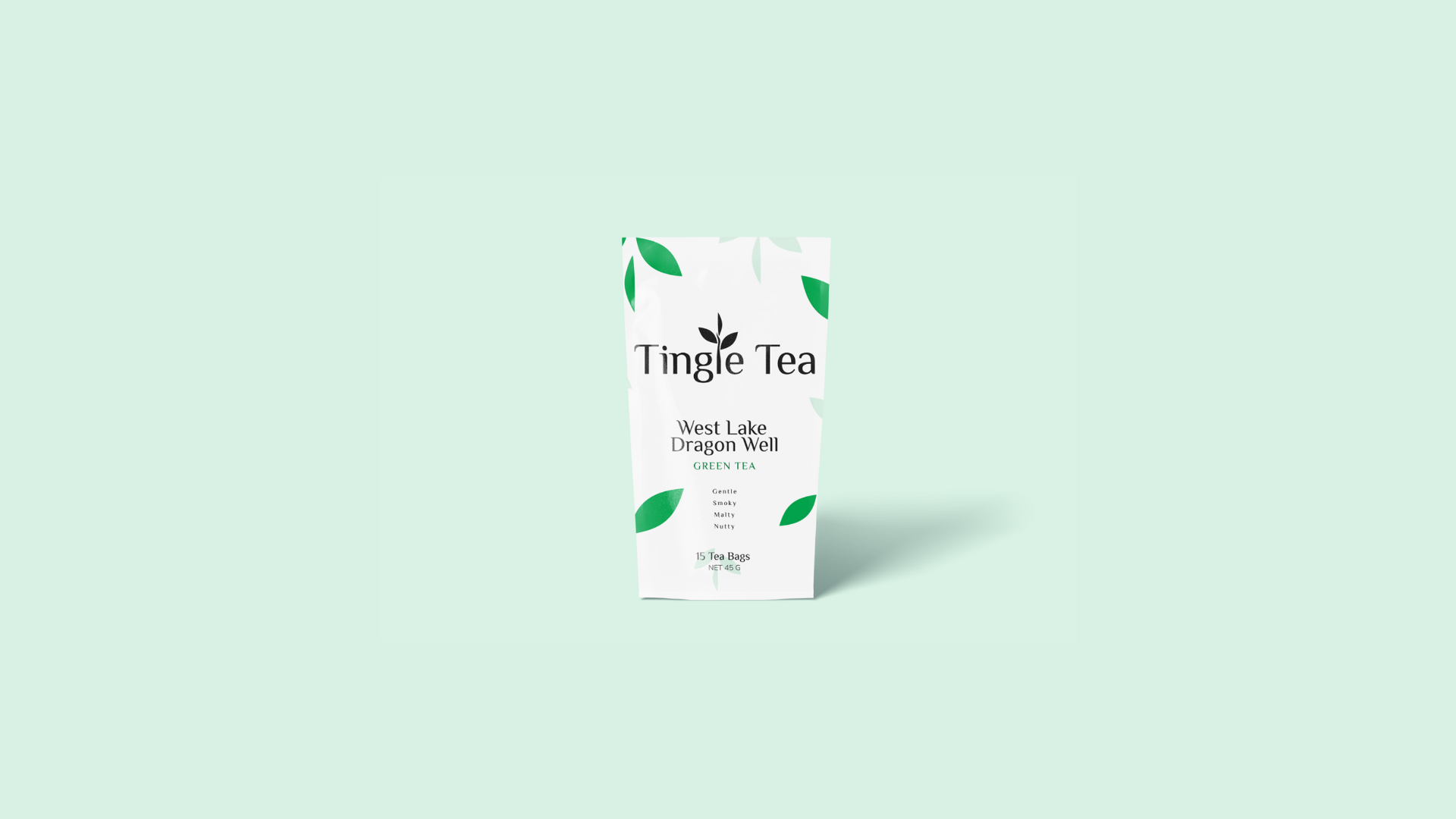
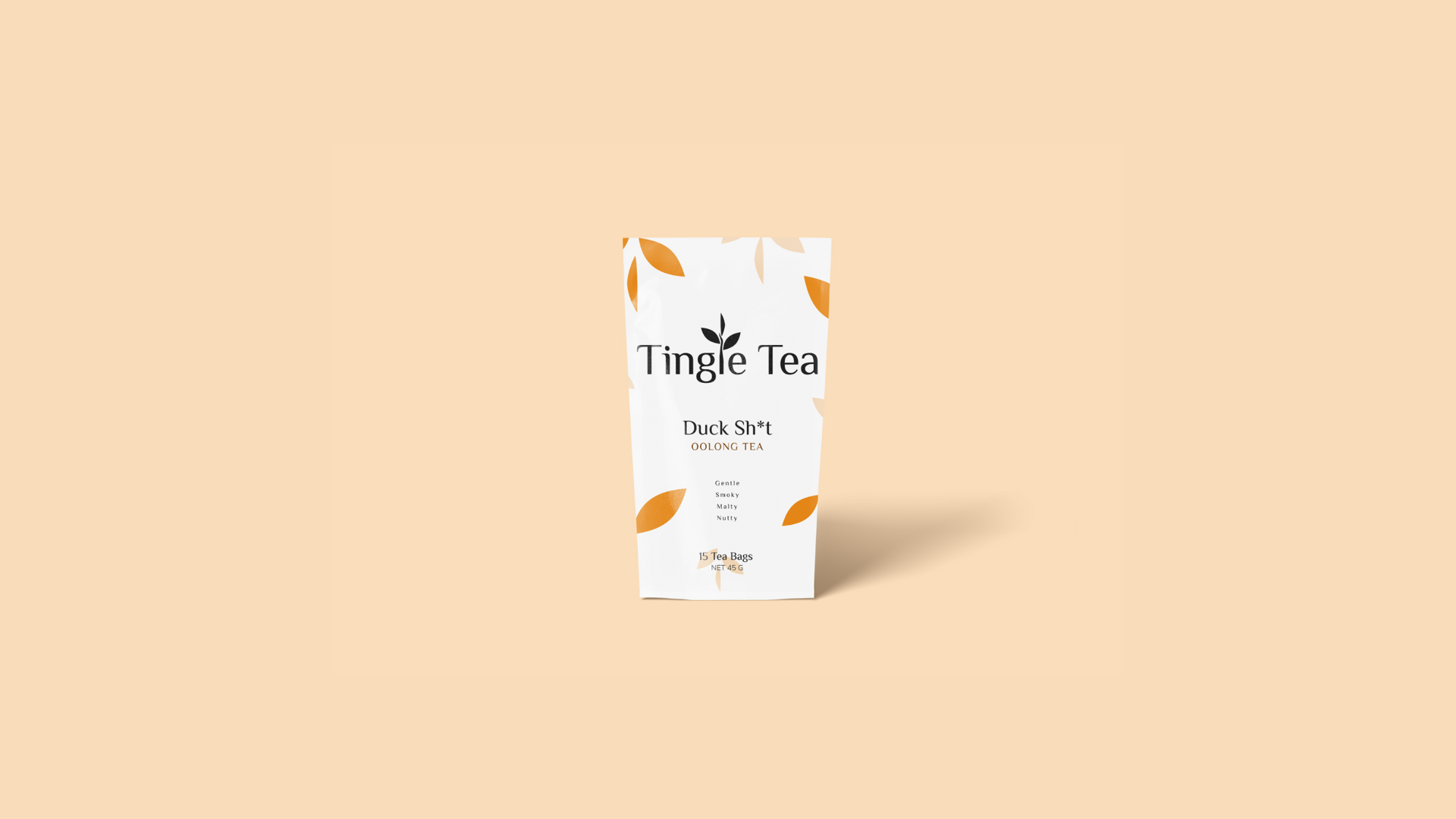
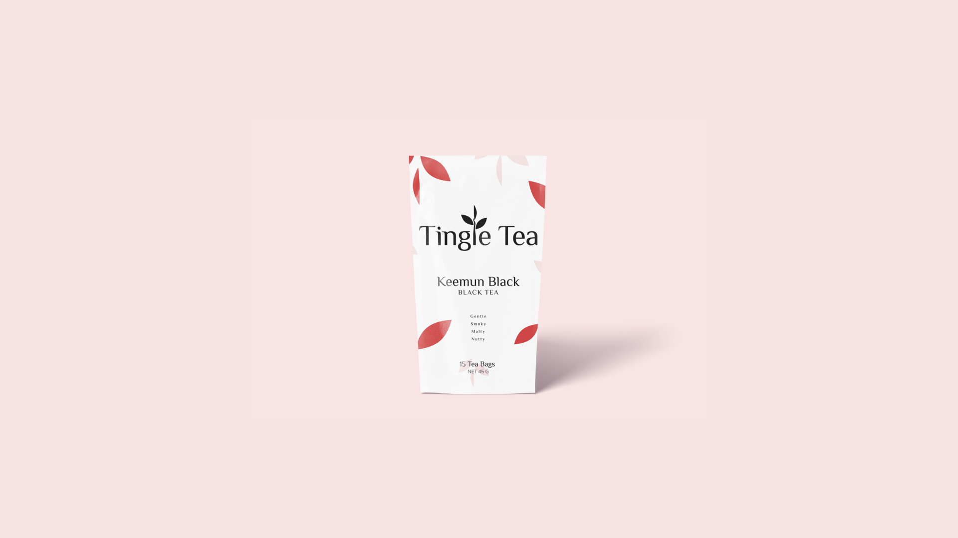
To meet the client's need for immediate product differentiation, a secondary color palette was established. This systematic approach assigns a unique, distinguishable color to each tea type (Green, Oolong, Black) directly on the packaging, ensuring consumers can quickly and reliably identify their preferred product at a glance.
Research-Driven, Mobile-First Web Strategy:
The final website was designed using a strict Mobile-First methodology, directly driven by preliminary customer research that indicated the target audience primarily accesses content via mobile devices. This strategic decision was crucial for optimizing user experience. Furthermore, the design balanced the need for a unique brand presence with established user conventions to ensure the site felt both distinctive to the brand and immediately familiar and intuitive to the user.

